Companies
Framestore

They are company based in London and New York. Some of the things they focus on are making moving images, entertainment and film industries, design and digital for the advertising.
The company started out from just 5 partners in which they all had a same goal of making a company that focused on producing an amazing visuals whilst working with the clients. Clients such as art directors, film directors, musicians etc. Their journey has gotten from starting out with just 5 men to over 600 artists, animator, visualiser etc. They now work with clients from every continent.

Pentagram


Pentagram is the worlds largest independent design consultancy. It is run by 19 people who
are all friends and leaders in their own creative fields. They are currently working around few famous cities such as Berlin, London, San Francisco, Austin and New York. They like to focus on majority of creative fields from architecture, interiors, digital installations to exhibitions, books, poster etc. When they are collaborating with their clients they work directly with one or more of their main founders.
Here are some of their works.


This is one of their work they did for print books. Its a cover concept for the classic book by Vladimir Nabokov. I chose this to talk about because it gabbed my attention right away, maybe because of its colour. The colour stood out for me first of all then the cut out letters which reads 'Lolita'. I like how the cut out letters aren't perfect and done with huge care. Like how its so raw and just natural. I like the idea of writing something inside of a cut out heart. Even though I cant really tell what it says, its very fitting to this whole style of being natural. This doesn't looked planned at all, the feel of it. Another thing I like is that the cutting is probably done on a page from the book it self. The colour really helps it stand out as for me its the main thing that captures me.
Lambie-Nairn


They have been creating dynamic brands for 40 years which have been evolved overtime. They believe brands are fluid which in time should be able to evolve successfully and develop overtime. Its like us humans; changing every time we experience new things and getting better. Brands continuously should be able to follow this cycle of continuity and change along with its environment. Their clients include numerous well known names like BBC, ITV, O2 etc.
some of their works


I want to talk about this project of theirs 'Think Big- Creative Invite'. This project is all about helping young social entrepreneurs get their ideas off the ground. Their whole main of this project was to inspire the young people and put them on notice. The image above is the work of the winner from the 454 entires. I too really like the piece. Its really lovely to look at first of all and the message its sending out is very meaningful. Its about the technology for children to the outdoors. Also the concept is backed up with really solid illustration.
Questions
* What are the thought processes you go through when thinking of an idea?
*Do you think that design will continue to progress even in the future?
*Do you get inspired by the things you see in your daily life?
weekly plan
Lucille Tenazas

Lucille Tenazas is currently a professor at parson's new school design which in located in New York. She is recognised for her role in transforming modern ideas into design practice. Her nationality is Philippines but she moved to New York in 1979 with a degree in fine arts and a curiosity of design. She is the founder and the principal of Tenazas design. It is a multidisciplinary communications design firm based in San Francisco. In her designs, you can find complexity of language and the overlapping relationship of meaning, form and content. She received/honoured one of the ID forty in 1995, one of the america's 40 leading design innovators.
Tenazas design clients consists of wide range of public, non profit and private institutions such as San Francisco Museum of modern art, Henry art gallery, Metro furniture, San Francisco International airport etc.

Tenazas design clients consists of wide range of public, non profit and private institutions such as San Francisco Museum of modern art, Henry art gallery, Metro furniture, San Francisco International airport etc.


This piece of hers is really weird and hard to grasp on to. Its a poster design. Theres something really simple that gravitates you. At first I notice the white space which is mainly in the middle of the poster but is laying around outside. The warm yellow blends in really well with the white. It kind of compliments the white negative space and enhances it making it smooth and easier for the eyes to look upon it. After that the cutout images of furniture of some sort is the focus. These manipulated images contrast with the negative white spaces in a weird sense. Almost like the missing pieces scattered around just waiting for someone to place it back to its original location. The typography is the last thing I come across upon maybe because of the ways its constructed. As you can see some parts of the letters are missing resembling the image behind. The word constructed in the key as the whole poster I think is focused around it. The whole thing is in need of a construction thus the negative space and images are featured.
Construction


Construction is a process of building something. It could be anything like house, table, vehicles, idea etc. You need pieces to construct something. Everything is done step by step following the simple rules of constructing. We can't construct something out of nothing, we need important pieces. Just like the poster from earlier its showing us the parts. Its all present there. Theres an art in constructing. We are all bringing these parts together to create something that is in our head. Every non/living things are constructed, some in a different way than others.

This is another poster she did for AIGA San Francisco. Theres some kind of warm vibe projecting out of it. For me its definitely projecting out the lovely warm yellow and how it is placed around the poster. Its not heavily overused, thats what I like about it because less is more. The small usages of shaped yellow colour in big white space is very captivating. The more you look at it, the more you it grows on you. The shapes are so carefully thought of and placed. The simple usage of shapes in a big area has a massive impact. Also the typography compliments the shape and the whole vibe of the poster. The typography are really well structured and fits the shapes that are present in the poster. I really like the line that runs straight across the middle. It links well with the whole feel and the separation from one to another.
Shapes

When seeing shapes people get different affects. They are an important piece in the visual grammar and visual thinking. Shapes have different characteristics just like us, each of them communicating differently to us. Designers use shapes to convey mood/emotion, to lead one thing to another element, create movement, texture. They are a powerful way to communicate.
There are 3 different types of shapes: Geometric shapes, Organic shapes and Abstract shapes.
Geometric shapes

This is what most if the people think when talked about shapes. Shapes like circle, triangle, squares are easily recognisable.
Organic shapes

Geometric shapes

This is what most if the people think when talked about shapes. Shapes like circle, triangle, squares are easily recognisable.
Organic shapes

They are irregular; with curves and uneven sides. The vibe they give out is comforting and pleasing. These shapes are mostly found in nature; leaves, cloud, puddle etc. They have free form and asymmetrical.
Abstract Shapes

They are recognisable but are not real. For example a straight line could represent a person. The image above is an example where these typographic glyphs are abstract shapes that represent letters. The energy they give out can be either positive or negative.
Meaning of Shapes
Circle


As you can see this shape is going round and round. Circle has no ending or beginning. They have free movement, rolling around endlessly. The energy it projects is on-going power. It also suggest infinity.
Square/Rectangle
Squares are stable just like they look opposite of circle. They are the most common shapes. Most of the information/text we read are found inside these two shapes. In buddhist square represents earthbound and circle represents eternal whole.
Triangle
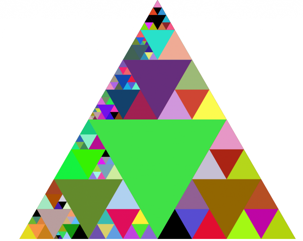
Triangles are balanced/dynamic. They can be stable when sitting on their base and unstable when not. Triangle can be symbol for triangle, law, science. Most familiar themes that can be represented to a triangle are pyramid, pennants and arrow.